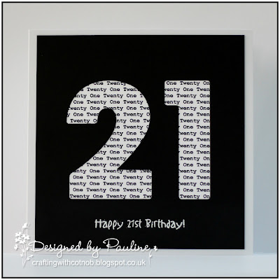
As soon as I saw the theme of 'Alphabet' this idea popped into my head - I don't know why, it's more text than alphabet but I hope it's OK.
I used my Tonic Number dies to cut the '21' from black card stock and just placed the text, which I computer generated, behind it. The sentiment is a Woodware stamp heat embossed with white embossing powder.
Thank you for calling today, your company is much appreciated.
Pauline
x


28 comments:
Its a great idea you had Pauline they way you have interpeted the theme. Love the numbers and keeping it CAS is perfect as the numbers speak for themselves. Hugs Jennifer xx
A Great idea Pauline. I Love it! Barbxx
Love the striking simplicity of this wonderful card Pauline xx
Wunderschöne Karte.
glg Gertrude
fantastic card Pauline
Gr Karin
Beautiful CAS card, Pauline.Love the numbers.Great design.
Hugs, Sylvia x
Love this awesome card!
hugs,
Ans x
Fantastic, a real statement card.
Great design, so striking!
Beautiful card. Love the design.
Valerija xx
What a brilliant idea, fabulous card.
Kath x
cool make Pauline! Love it! Hugs rachel x
I love the crisp graphic design of your card, Pauline! Those number dies are really striking and look great with the text behind them - perfect for our alphabet challenge. Thank you for playing along with us at Less is More this week :)
That computer generated text behind the cut out numbers is one fantastic idea! Love this!
AWESOME love the simplicity of the card.xx{aNNie}
Brilliant idea Pauline it's very effective.
Hugs Julie xxx
Fantastic dynamic design and looks fantastic with the black a real stand out.
Mari
Such a bold, cool and very contemporary card Pauline, it'll be right on trend for any 21 year old! Adding the written age behind those die cuts was inspired. Love it. Thanks so much for sharing this with us at Less is More xx
Your digital skills, your stamping and die skills have certainly come to the fore with this dramatic card, it will certainly take centre stage amongst the others that will be on show.
Faith
x
Cool and contemporary, and at the same time timeless. Works equally well for a girl as for a boy.
great card!
hugs , Fiki
My Little Shop-Crafty Kitty Cat Shop
≽ܫ≼
Brilliant CAS card love the large 21 die-cut numbers and the text behind
Carol x
A lovely and simple design in classic black and white! Clever idea for the LIM challenge!
Oh wow, I LOVE the impact of this design! What a fab idea to have the text background in the 21 - it looks brilliant and really adds interest. Thanks so much for playing along with us at Less is More :)
Simple design that makes it fantastic!
xoxo Olga
That's one bold, neat and clever take on our alphabet challenge Pauline. I'm sure the recipient is going to love this one! It certainly packs a punch! Thanks for playing along with us at Less is More. x
A superb card for a 21st. Very modern and works for either male or female.
Brilliant design Pauline. Super CAS card and perfect for a 21 year old xx
Post a Comment